
From the cryptic glow of arcade screens to the dazzling fidelity of modern blockbusters, the visual history of video games is nothing short of mesmerizing. Graphics aren’t just an ornamental side dish—they’re often the very identity of a game, the first handshake with its audience. They set mood, shape worlds, and breathe life into stories where words would fail. As much as we love the refrain “gameplay is what matters,” a game’s visual soul is never accidental. Whether immersing us in alien landscapes or guiding our imaginations through minimalist suggestion, graphics are the bridge between code and experience.
The importance of visuals extends well beyond surface beauty. Graphics define how we navigate virtual spaces, what emotions a scene evokes, and even how mechanics unfold. Early limitations forced wild creativity, making every pixel precious. Later, advances in silicon and software unlocked new narrative techniques—cinematography, expressiveness, ambience—that transformed mere interaction into something truly immersive.
Of course, the debate lingers. Some will always claim that clever design trumps all, that nostalgia for simpler graphics is proof visuals are secondary. But the truth is more nuanced: visuals and gameplay are interwoven, each amplifying the other when done right. An evocative art style can make mediocre mechanics sing, while technical wizardry is empty without inviting gameplay.
This article isn’t just a parade of pretty games; it’s a timeline through the turning points in graphical innovation—a reflection on how visuals mirror the ever-changing ambitions of the medium itself. From abstraction to photorealism, join us as we wander through the evolution of graphics, exploring how each leap forward echoed through the worlds we play. (And check out our D&D character generator if you want to create avatars…Trust me on this one.)
1970s: Birth of Video Game Visuals
In the primordial dawn of video gaming, graphics were born out of necessity. The technology available—oscilloscopes, CRTs, and primitive chips—dictated what the player could see, and, by extension, what kinds of experiences could exist. Mechanics and visuals grew in lockstep, each limitation an invitation for ingenuity.
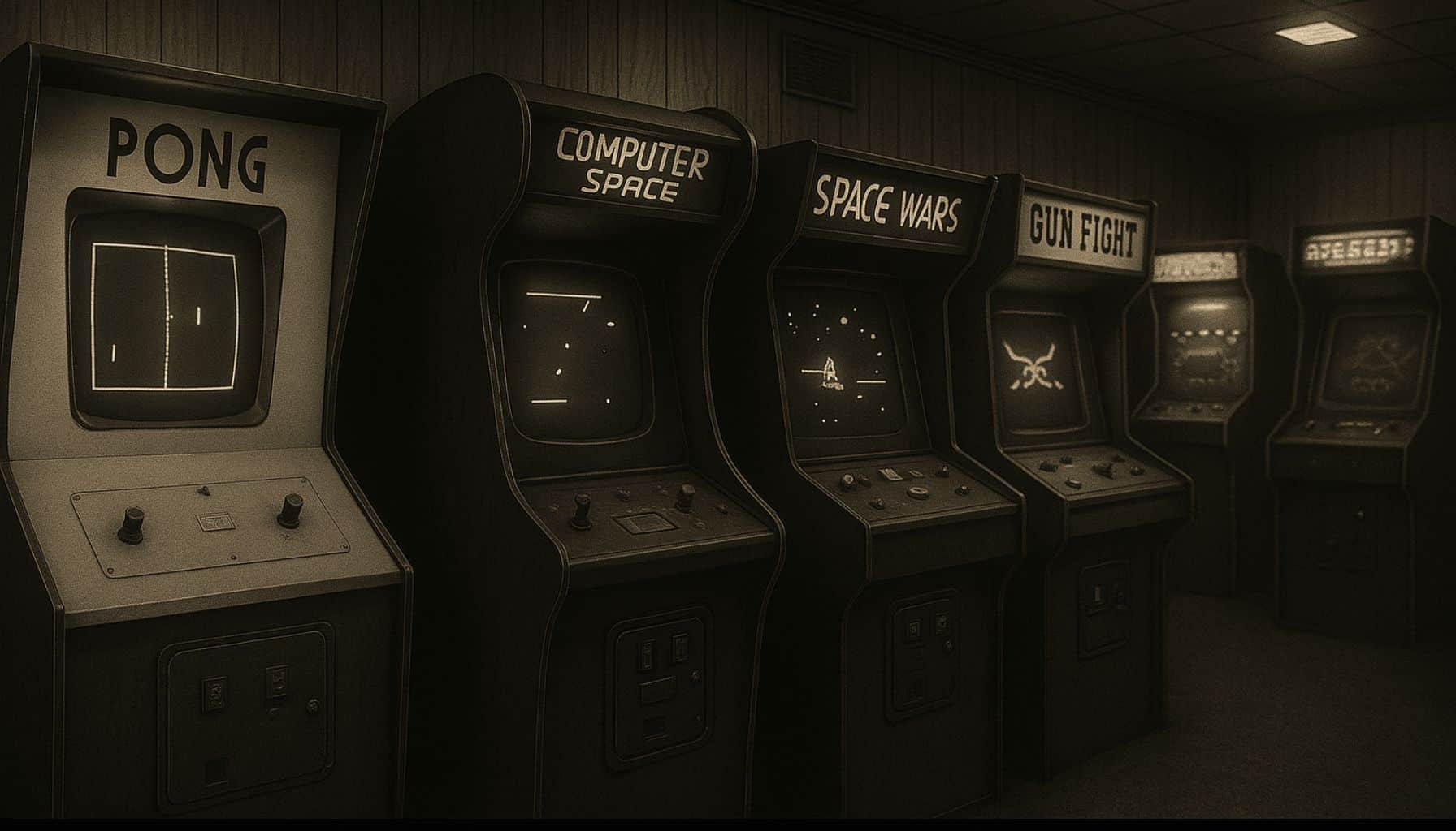
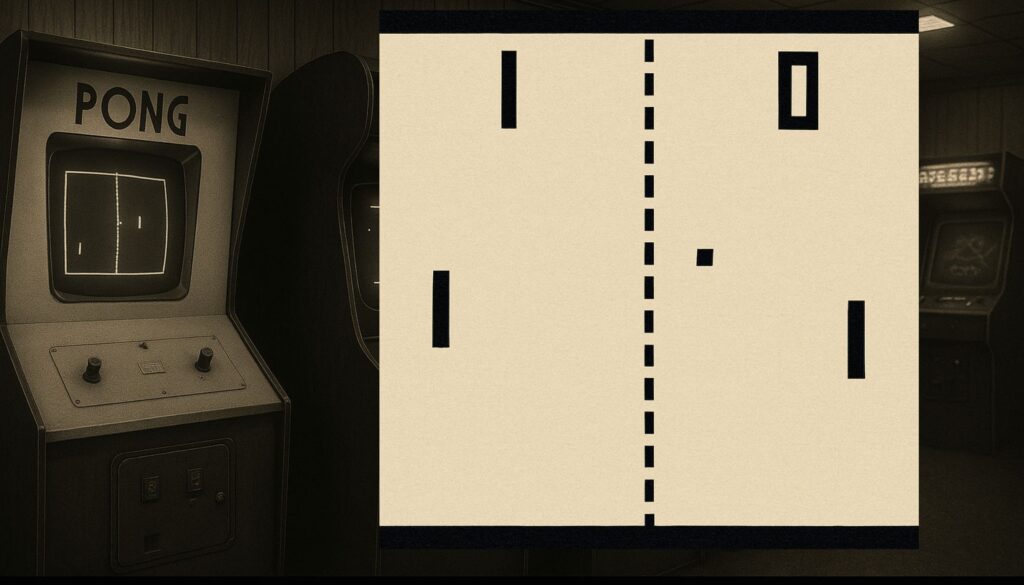
Games like Pong or Computer Space leaned into their abstract forms, inviting audiences to suspend disbelief. The thrill was in the newness: the glow of moving shapes, the illusion of interaction, the sheer novelty of seeing anything move at all in response to your actions. The concept of “immersion” was embryonic, but the seeds were there—players projected themselves onto dots, squares, and lines, because that was all they had.
Try my AI Tabletop RPG generators...and an extensive library of content!
At this stage, visuals weren’t window dressing; they were the game. With no memory for complex graphics, devs conjured entire worlds from a handful of monochrome pixels set loose on vector or raster displays. Simplicity wasn’t a choice, it was survival—and yet, even these first flickers shaped the path to come.
Vector and Raster Displays
The earliest video game graphics can be divided into two camps: vector and raster. Vector graphics, with their crisp, bright lines, drew directly on the phosphors, creating shapes from mathematical precision. Raster graphics filled the screen pixel by pixel, arranging tiny dots into recognizable images.
Games like Asteroids became iconic with vectors, presenting hypnotic outlines that glowed with eerie intensity. Space War, one of the earliest competitive games, ran on an oscilloscope, its starfields and ships rendered as white lines on black. Raster, on the other hand, laid the groundwork for future complexity—a canvas for sprites, backgrounds, and dazzling effects.
Vector graphics were a revelation for clarity and fluidity, ideal for games with simple forms and instant feedback. Raster enabled growth: more colors, more detail, and—eventually—animation. Each technology had its heyday, but only one would withstand the test of time.
⚔️ Fantasy RPG Random Tables Books
Make life as a Gamemaster easier…
If you play Dungeons & Dragons, Pathfinder, or other fantasy RPGs, this
RPG random tables series
is packed with encounters, NPCs, treasure, and more. Available in eBook or print—either way, you’ll have a wealth of adventure ideas at your fingertips.


Early Arcade Games and Their Rendering Methods:
- Pong (1972) – Raster: Monochrome paddle/ball, pixel grid
- Computer Space (1971) – Raster: Abstract ships, limited shapes
- Asteroids (1979) – Vector: Glowing outlines, smooth rotation
- Space War (1977) – Vector: Sharp lines, starfield
- Battlezone (1980) – Vector: 3D wireframe tanks, minimalism
- Lunar Lander (1979) – Vector: Terrain lines, precise movement
- Breakout (1976) – Raster: Color overlays, basic blocks
- Tail Gunner (1979) – Vector: Starfield illusions, projectile trails
- Tempest (1981) – Vector: Dynamic tube, perspective play
- Galaxian (1979) – Raster: Early color, vibrant enemies
- Missile Command (1980) – Raster: Explosions, color gradients
- Space Invaders (1978) – Raster: Monochrome, hardware overlays
Monochrome to Color
If the 1970s began in black and white, it was only a matter of time before color erupted. Yet, this wasn’t an overnight transformation. The earliest color was often faked: transparent overlays slapped atop screens, patches of blue, red, or green casting their tints onto blocky universes. Hardware remained largely monochrome, with color only an illusion.
True hardware color arrived piecemeal. Inventive uses of RGB circuitry brought richer palettes, but the limitations were stark—few colors, little control, and often garish results. Still, even rudimentary color could make a game leap out from the drab competition, catching players’ eyes in a sea of sameness.
Galaxian, debuting in 1979, marked a genuine shift: not just color, but vibrant, animated, coordinated color—powered directly by hardware. Suddenly, the arcade glowed in electric blues, reds, and greens. This breakthrough would unlock a cascade of creativity, transforming game art from a novelty to a vital centerpiece.
| Game Title | Year | Color Method Used | Historical Significance |
|---|---|---|---|
| Space Invaders | 1978 | Overlay | Color “bands” faked on monochrome display |
| Galaxian | 1979 | Hardware RGB | First true multi-color animated sprites |
| Pac-Man | 1980 | Hardware RGB | Iconic colors, distinct character design |
| Frogger | 1981 | Hardware RGB | Highly visible multicolored sprites |
| Defender | 1981 | Hardware RGB | Fast, vivid scrolling backgrounds |
| Donkey Kong | 1981 | Hardware RGB | Storytelling via bold color palettes |
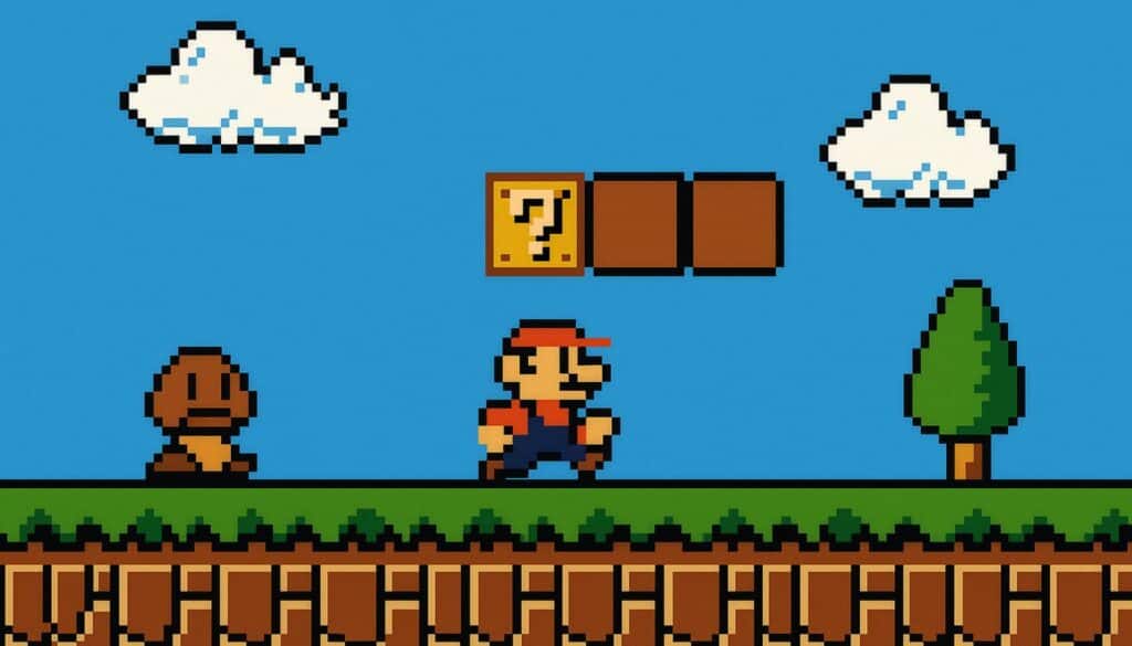
1980s: The 2D Golden Age
The 1980s saw the full flowering of 2D graphics. With memory and hardware costs dropping, sprite-based design exploded in both arcades and home consoles. Suddenly, games could deliver expressive characters, scrolling landscapes, and genuine animation—not just outlines, but personalities and places.
Parallax effects, side-scrolling, and tile-based rendering became the tools of the trade. Games like Super Mario Bros and Sonic the Hedgehog blurred the line between levels and living worlds, immersing players in vibrant, kinetic spaces. The visual language of platformers, shooters, and beat-’em-ups was codified during this golden age.
No longer bound by abstract forms, games could now tell stories at a glance. Whether through cutscenes framed as comic panels or the looping serenity of a moonlit backdrop, art direction became as important as mechanics. The era proved that style and substance could dance hand in hand.
Sprites and Parallax
Sprites—the pixelated building blocks of character and object animation—were the backbone of 80s game art. Sprites allowed for flipping, cycling, and remixing tiny art assets at a scale never seen before. Pac-Man gobbled dots with a hungry mouth animated by just a couple of frames, yet those sprites remain burned into gaming memory.
Parallax scrolling, popularized by games like Moon Patrol, brought illusionary depth by moving background layers at different speeds. Suddenly, levels weren’t flat—they possessed a sense of place, of travel, of kinetic energy propelling the player forward. Sonic the Hedgehog took parallax and sprites to dizzying heights, combining blurs of motion and layered scenery in a visual feast.
Tile-based rendering let artists stretch budgets further: a single block of dirt or sky could be reused endlessly, letting even modest memory conjure vast worlds. Sprite sheets became a new form of artistic discipline, with every frame and tile meticulously orchestrated.
The beauty of these techniques was in their limitations—they forced clarity, boldness, and memorable silhouettes. What players recall decades later isn’t photorealism, but the crisp joy of movement, color, and character.
Graphical Techniques and Tricks of 80s Sprite Games:
- Flipbook animation
- Sprite sheets
- Hardware scrolling
- Parallax scrolling
- Tile-based backgrounds
- Color palette cycling
- Multiplexed sprites (layering for larger bosses)
- Sprite flipping (horizontal/vertical reuse)
- Raster effects (waves, distortions)
- Spritemasking for transparency/occlusion
- Multiplexing to fake more sprites per scanline
- Animated tiles (shimmering water, flames)
- Overdraw for outlined shadows and highlights
Vector Fades, Raster Rises
As the 80s marched on, raster graphics left vector in the dust. Raster’s ability to do filled shapes, layered sprites, and animation simply dwarfed vector’s clean lines. Suddenly, the market wanted color and abundance, not austere geometry.
⚔️ Fantasy RPG Random Tables Books
Make life as a Gamemaster easier…
If you play Dungeons & Dragons, Pathfinder, or other fantasy RPGs, this
RPG random tables series
is packed with encounters, NPCs, treasure, and more. Available in eBook or print—either way, you’ll have a wealth of adventure ideas at your fingertips.
Defender showcased the power of raster: a sprawling, horizontally scrolling playfield teeming with ships, explosions, and neon landscapes. Xevious layered backgrounds and foregrounds, using color and sprite interaction to enhance its hypnotic, never-ending terrain. The possibilities of complex playfields were endless compared to the logical simplicity of vector.
Vector hardware, expensive and niche, couldn’t compete with the visual variety raster enabled. The baton had been passed. Raster’s reign would endure for decades, laying the bedrock for every future leap.
Scaling and Isometric Tricks
But having more pixels wasn’t enough—developers craved depth. Enter “scaling” tricks: objects would grow as they approached and shrink as they receded, faking a third dimension. Racing games like Turbo and Out Run used this to conjure wild speed, stretching and skewing roadside sprites to simulate perspective.
Sega’s Space Harrier took it further, barreling players forward through expanding sprite worlds at breakneck speed. Meanwhile, isometric projection—showcasing scenes from a skewed, pseudo-3D angle—opened up new strategies and types of play. Zaxxon’s isometric space fortress was a marvel, challenging players to navigate apparent height and depth.
These illusions weren’t “real” 3D, but they planted the seeds. Every scaling, skewing, and forced perspective was a step toward the eventual 3D revolutions to come.
Games That Used Scaling, Skewing, or Isometric Illusions:
- Zaxxon (isometric, 1982)
- Marble Madness (isometric, 1984)
- Space Harrier (sprite scaling, 1985)
- Out Run (road scaling, 1986)
- After Burner (perspective scaling, 1987)
- Super Hang-On (scaled edges, 1987)
- RoadBlasters (sprite scaling, 1987)
- Contra (scaling boss parts, 1987)
- F-Zero (Mode 7 rotation/scaling, 1990)
- Sonic 3D Blast (isometric, 1996)
- Solstice (isometric puzzle, 1990)
- Landstalker (isometric RPG, 1992)
1990s: The 3D Revolution
The 1990s detonated expectations. Arcade and home hardware leapt forward, enabling true polygonal 3D graphics, texture mapping, and ever-more convincing animation. Where once pixels and tiles ruled, now vertices and faces shaped heroes and worlds.
Polygon counts rose, characters twisted in real-time, and pre-rendered scenes added cinematic grandeur. The transition wasn’t smooth—exposed seams, fog, and blocky models were as much a hallmark of the era as the sheer thrill of new possibility.
None of it would have happened without astonishing leaps in hardware: the advent of GPUs, coprocessors, and dedicated 3D rendering chips. Suddenly, geometry wasn’t a pipe dream—it was the medium. These advances upended art direction, game genres, and even the kinds of stories games could tell.
The graphical breakthroughs of this era weren’t just about technical power. They marked a new appetite for realism, complexity, and cinematic spectacle—games wanted to be not just games, but experiences.
Flat Shading and Early 3D
Early real-time 3D didn’t have space for fancy textures or lighting tricks. Flat shading—where each polygon facet was shaded a single color based on its angle to a virtual light source—became the default look. The results were stylized, angular, but undeniably, thrillingly three-dimensional.
Games like I, Robot and Stunt Car Racer embraced this “chunky” aesthetic, their worlds bright and abstract by the necessity of hardware. No textures meant smoother performance, but it also gave rise to a distinctive look—clean, mathematical, and oddly timeless.
As technology advanced, Gouraud and Phong shading softened the harsh edges, gradually bridging the gap to realism. Lighting and perspective became key elements, giving once-sterile worlds a new sense of place and drama. Hardware battled to keep up, and the results were as experimental as they were iconic.
| Game | Shading Method | System/Hardware |
|---|---|---|
| I, Robot | Flat Shading | Atari Arcade (1984) |
| Stunt Car Racer | Flat Shading | Commodore Amiga/Atari |
| Virtua Racing | Flat Shading | Sega Model 1 (Arcade) |
| Star Fox | Flat Shading | Super FX Chip (SNES) |
| Hard Drivin’ | Flat Shading | Atari Arcade |
| Elite | Wireframe | BBC Micro, C64 |
| Battlezone (revisit) | Vector/Flat | Arcade (Atari) |
Mode 7 and Super FX
Not all systems could handle true polygonal worlds. Enter “trickery” in the form of hardware scaling, rotation, and transformation—most famously Nintendo’s Mode 7 on the SNES. With Mode 7, games like Super Mario Kart faked racetracks by warping flat backgrounds in real time, creating a convincing illusion of depth.
The Super FX chip, first seen in Star Fox, powered a leap to low-poly 3D on a cartridge-based system. It was a technical marvel—primitive by today’s standards, but mind-blowing in the early 90s.
These hardware effects became the workhorse for simulating 3D, from faux-rotating stages to scaling sprites until they “flew” at you.
Console Games That Used Rotation, Scaling, or Faux-3D:
- Super Mario Kart (Mode 7, SNES)
- F-Zero (Mode 7, SNES)
- Pilotwings (Mode 7, SNES)
- Star Fox (Super FX, SNES)
- Doom (Super FX, SNES port)
- Axelay (background scaling, SNES)
- Yoshi’s Island (Super FX 2, sprite mesh warps, SNES)
- Castlevania: Dracula X (rotation bridges, SNES)
- Stunt Race FX (Super FX, polygonal vehicles, SNES)
- Contra III (rotating/zooming stages, SNES)
- Top Gear (road scaling, SNES)
Raycasting and Pre-rendered Backgrounds
On PCs, memory and CPU power were at a premium, but innovation thrived. Raycasting—a technique that traced “rays” from the player view—allowed for quasi-3D environments with texture on walls but none on ceilings or floors. Wolfenstein 3D and Doom used this to brilliant effect, creating labyrinths of terror and speed with efficient trickery.
Try my AI Tabletop RPG generators...and an extensive library of content!
Pre-rendered backgrounds became another solution for lush settings on limited hardware. Alone in the Dark, Resident Evil, and Final Fantasy VII used high-quality static images while animated characters moved atop them, blending the best of both worlds.
These techniques squeezed every drop from humble machines, creating atmospheres that stretched far beyond their technical limitations.
Tricks to Stretch Visual Fidelity on Low-End Systems:
- Background sprites
- Palette cycling
- Dithering
- Hardware-based scaling
- Lighting hacks (sector-based, fake flicker)
- Sprite stacking
- Texture repetition
- Mirrored backgrounds
- Pre-rendered cutscenes
- Gouraud shading on flat models
- Billboarding (always-face-the-camera sprites)
- Environmental mapping
2000s: Realism and the Grit Era
The 2000s were consumed with a drive toward “realism”—not just in detail, but in tone. Graphics engines delivered normal mapping, dynamic shadows, and specular highlights. Palettes grew muted, earthy, and often, unapologetically brown. Games like Gears of War and Call of Duty defined the era, where worlds seemed perpetually overcast or bombed-out.
This was the decade of “cinematic immersion.” Lens flares, motion blur, depth-of-field—effects once reserved for film became integral to games. The goal was to create not just play spaces, but places that felt heavy, substantial, and at times, wearyingly real.
Yet, as fidelity increased, questions arose about the cost: Was more “real” actually more beautiful? Were games slowly losing their visual soul to the grayscale grit of verisimilitude?
Brown and Bloom
Color grading took a sharp turn into sepia, ochre, and concrete. “Realism” became synonymous with dirt, rust, and haze. Lighting models emphasized harsh sun and bloom effects—where bright glows bled across the screen like an overexposed photograph.
Games employed screen-space tricks—high dynamic range, god rays, screen space reflections—to simulate physical cameras. It was mesmerizing (and sometimes migraine-inducing). The infamous “bloom” became a crutch, slathered atop everything from shooters to fantasy RPGs.
The look was gritty, heavy, and often joyless—an attempt to capture the “reality” of conflict, struggle, and drama. Why did so many games look the same? Sometimes because it was easier, sometimes because audiences expected it, but mostly because the tools rewarded it.
Visual Clichés of 2000s Realism-Driven Design:
- Brown/gray color grading
- Bloom lighting
- Lens flares
- Depth-of-field blur
- Motion blur
- Overexposed highlights
- Specular “wet” surfaces
- Film grain overlays
- High dynamic range (HDR) blooms
- Dust/particle fog
- Desaturated world palettes
- Gritty vignette edges
Stylization Fights Back
Despite the palette of gloom, some developers boldly chose style over fidelity. Cel shading, hand-painted textures, and exaggerated forms brought visual whimsy roaring back. Games like The Legend of Zelda: Wind Waker stunned fans with bright, cartoonish worlds rendered in expressive ink-like lines.
⚔️ Fantasy RPG Random Tables Books
Make life as a Gamemaster easier…
If you play Dungeons & Dragons, Pathfinder, or other fantasy RPGs, this
RPG random tables series
is packed with encounters, NPCs, treasure, and more. Available in eBook or print—either way, you’ll have a wealth of adventure ideas at your fingertips.
Okami painted mythic Japan in watercolor washes and elegant brushstrokes, while Jet Set Radio’s graffiti-art cel shading oozed attitude and vibrance. These choices were polarizing at first but proved prescient—style, not just resolution, could define a generation.
Stylized games reasserted the value of identity, clarity, and playfulness. They proved that visual risk-taking could stand out even in a sea of realistic drabness.
| Game Title | Artistic Technique | Visual Appeal Focus |
|---|---|---|
| Wind Waker | Cel shading | Expressive, cartoon animation |
| Okami | Ink/watercolor | Brushstroke/painted effects |
| Jet Set Radio | Cel shading | Graffiti aesthetic, attitude |
| Viewtiful Joe | Comic book shading | Action/comic stylization |
| XIII | Graphic novel effect | Outlined, pop-graphic cutscenes |
| Killer7 | Abstract shading | Surreal minimalism |
| Valkyria Chronicles | Pencil/paint filters | Storybook military |
| Borderlands | Outlined cel shading | Bizarre/wacky exaggeration |
| No More Heroes | High-contrast shading | Underground comic style |
| MadWorld | Black-and-white, red | Hyper-stylized violence |
2010s: Indie Innovation and Engine Power
A new dichotomy arrived. On one side, AAA studios wielded photorealistic power with monstrous budgets and ever-grander engines: Unreal, idTech, Frostbite. On the other, indie developers rediscovered the intimate appeal of minimalism—lovingly crafted pixel art, stark silhouettes, and tactile imperfections.
Blockbusters flaunted environmental detail, complex shaders, and intricate characters that blurred the line between digital and reality. Meanwhile, small studios and solo devs drew inspiration from early consoles and PC classics, using limited palettes and chunky pixels as a mark of both nostalgia and distinction.
The decade proved that graphical power wasn’t just about more—sometimes, less said the most. It was a golden age for both bombast and restraint.
Pixel Art Reborn
Indie developers revitalized pixel art, turning retro visuals into a proud, defiant statement. In titles like VVVVVV, crisp monochrome lines harkened back to C64 and ZX Spectrum. Limbo struck with haunting silhouettes, more shadow than substance, while Shovel Knight evoked 8-bit fidelity through screens crowded with smooth, modern animation.
These games weren’t limited by technical constraints—they chose stylization as honesty and aesthetic. Pixels became a language in their own right: raw, expressive, charmingly imperfect. Retro visuals created instant emotional resonance, both inviting newcomers and pleasing older fans with knowing winks.
This renaissance of lo-fi art encouraged new experiments: from coarse ASCII-styled dungeons to deliberately “glitchy” effects, indie gaming embraced visual quirk as a core virtue.
Notable Indie Games with Retro or Low-Fi Graphics & Inspirations:
- VVVVVV – ZX Spectrum/C64 minimalism
- Limbo – Silhouette art, German Expressionism
- Shovel Knight – NES platformers
- Hyper Light Drifter – 16-bit SNES/Genesis inspiration
- Undertale – Mother/Earthbound
- Celeste – SNES platformers, pastel pixel art
- Hotline Miami – Neon 80s, top-down shooters
- FEZ – Isometric pixel art, NES
- Stardew Valley – Harvest Moon, SNES RPGs
- Katana ZERO – Neon noir, action platformers
- Owlboy – Detailed 16-bit pixel art
- Terraria – 2D Minecraft meets 8-bit
- Dead Cells – Procedural 2D pixel action, Castlevania
- Risk of Rain – Minimalist characters, bold palettes
- The Messenger – NES to 16-bit platformers
Engine Domination
On the opposite end of the spectrum, graphical engines became king. Unreal Engine, Source, idTech, and CryEngine democratized development, enabling teams to start with powerful rendering toolsets right out of the box. This led to rapid advances, but also a certain “engine look”—a visual signature tied to middleware as much as to art teams.
Games like Gears of War, Half-Life 2, and Crysis became showcases for hardware-pushing trickery: dynamic lights, shaders, physics, and surface effects. Competition between engines accelerated progress, yet also invited criticism about homogenized art direction.
Still, the result was profound. Middleware let studios focus on art, design, and storytelling, raising the overall visual bar and empowering new kinds of spectacle.
| Game Title | Engine Used | Standout Visual Feature | Release Year |
|---|---|---|---|
| Gears of War | Unreal Engine 3 | Normal mapping, gritty detail | 2006 |
| Half-Life 2 | Source Engine | Facial animation, physics | 2004 |
| Crysis | CryEngine 2 | Real-time lighting, foliage | 2007 |
| BioShock | Unreal Engine 2.5 | Atmospheric water/shadows | 2007 |
| Deus Ex: Human Revolution | Crystal Engine | Gold-black color grading | 2011 |
| The Witcher 3 | REDengine 3 | Vast open world, weather | 2015 |
| Metro 2033 | 4A Engine | Lighting, environmental detail | 2010 |
2020s: Cinematic Techniques and Graphical Fidelity
Today, the cutting edge dazzles with visual intricacy reminiscent of high-budget cinema. Ray tracing bounces light through virtual spaces, casting nuanced shadows and reflections that shift with the time of day. Open-world games pack mind-boggling detail into every surface, from wrinkled skin to moss-flecked stones.
The divide between real-time rendering and pre-rendered cutscenes shrinks: every shadow reacts, every object is meticulously simulated. Photogrammetry and neural upscaling bridge the gap to filmed reality, while camera tricks—motion blur, chromatic aberration, depth-of-field—usher in a new age of cinematic immersion.
Yet even amidst hyper-fidelity, style endures. Some developers blend life-like detail with bold palettes, or twist realism to evoke moods that raw accuracy cannot.
Post-Processing and Lens Effects
Modern game engines are as much about post-production as they are about geometry. Chromatic aberration simulates lens flaws, separating colors at the screen’s edge for that “cinematic” imperfection. Depth-of-field draws the eye to what matters, blurring the rest. Lens flares and bloom replicate the behavior of physical camera glass. Motion blur—once a technical smudge—is now carefully tuned to evoke speed.
These effects do more than “pretty up” games—they guide the player’s sight, craft mood, and push the line between playing and watching.
Popular Post-Processing Effects and Their Purposes:
- Bloom – Simulated light bleed/glow
- Depth-of-field – Focuses player attention
- Motion blur – Conveys speed/movement
- Chromatic aberration – Mimics lens dispersion
- Lens flare – Artificial cinematography, sun glare
- Film grain – Adds texture, realism, grit
- Color grading – Alters mood/tone
- Vignette – Draws attention to screen center
- Screen space reflections – Dynamic mirror surfaces
- Ambient occlusion – Enhanced contact shadowing
- Sharpening filters – Increased perceived “detail”
Real-Time Lighting and Environmental Systems
Dynamic lighting is now central to modern design. Global illumination algorithms simulate the bounce and spill of light, making sunlight beam into dusty rooms and neon reflect off rain-slick concrete. Volumetric fog and clouds add atmosphere, while dynamic weather and day-night cycles bring worlds alive.
Games like Red Dead Redemption 2, Cyberpunk 2077, and Horizon Forbidden West showcase detailed, living environments where light, weather, and time are as vital to narrative as they are to spectacle. The push for real-time fidelity is relentless, but as always, art direction determines not just what is possible—but what is memorable.
Final Reflections on Graphics
From flickering vectors to ray-traced metropolis streets, the evolution of graphics is a journey of constraints, invention, and bold aesthetic leaps. Each era—abstract, cartoon, photoreal—reflects not just technological change but cultural shifts in what games wished to be.
If history teaches anything, it’s that style, cohesion, and the honesty of creative vision always outshine brute technical force. The most celebrated visuals aren’t the busiest, but the clearest; not the most realistic, but the most evocative. Games become immortal when their graphics amplify their world, story, and spirit.
Room for imagination matters as much as detail. Whether through minimalist silhouettes or painterly flourishes, what draws us in is a sense of place—a promise of adventure, challenge, or wonder. Visuals are never incidental; they’re the soul’s first whisper.
As we look back, the best graphics were those that fit their moment: daring, innovative, and, above all, memorable. The past is full of lessons for developers bold enough to listen.
Lessons Developers Can Learn from Video Game Graphics History:
- Limitations breed creative solutions
- Style creates timeless appeal
- Cohesion of art/music/mechanics matters
- “Realism” isn’t always synonymous with beauty
- Bold color choices endure
- Playful exaggeration stands out
- Post-processing should serve play, not obscure it
- Simplicity can foster clarity and mood
- Iteration enables evolution
- Art direction equals identity
- Memorable silhouettes matter more than fine detail
- Cultural influences shape perception of “good” graphics
Looking ahead, the boundaries of graphical possibility are blurring even further. Neural rendering and generative AI hint at bespoke, endlessly customizable worlds. The march toward real-time photorealism continues, but so too does the hunger for stylized, meaningful visual abstraction—especially in AR and VR, where immersion leans as much on style as fidelity.
Whatever the path, graphics will remain both a technology and an art: a means not just to impress, but to welcome us into new realms. Ultimately, visuals serve the stories we tell and the adventures we share—themselves, ever a reflection of the journey from pixels to photorealism.
⚔️ Fantasy RPG Random Tables Books
Make life as a Gamemaster easier…
If you play Dungeons & Dragons, Pathfinder, or other fantasy RPGs, this
RPG random tables series
is packed with encounters, NPCs, treasure, and more. Available in eBook or print—either way, you’ll have a wealth of adventure ideas at your fingertips.
